

Visit The Strategic Treasury Advisor – Part 1 to check out our first approach to Python in Excel.
The Hidden Story in Your Client’s Data
Every client has customers who pay late. The default approach is often inefficient—sending blanket reminders and straining relationships. But what if you could move beyond a simple “late list” and provide a more nuanced, strategic view?
This is how you elevate your role from analyst to advisor. By scientifically segmenting customers into distinct payment behavior groups, you can efficiently propose a targeted approach to receivables management that unlocks significant value for your client and opens the door for high-value treasury solutions. In this post, we’ll use a powerful data science technique called K-Means Clustering—right within Excel—to create a sophisticated, actionable customer segmentation.
The Scenario: Improving Receivables for
“Global Widgets, Inc.”
Following our previous analysis, our client, Global Widgets, Inc., wants to shorten their cash conversion cycle. They’ve provided 12 months of accounts receivable data, including invoice dates, due dates, payment dates, and customer names. They are looking for our advice.
For the Analyst: Grouping Customers with K-Means Clustering
I realize that “K-Means Clustering” is a niche topic. So I’m allowing readers to “opt-in” to the details of how this is done.
👈 Click to expand
Detailed Steps:
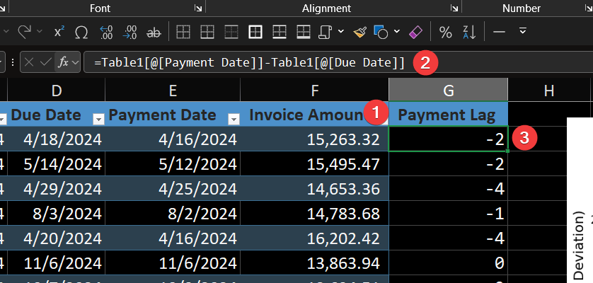
You will start with the provided Excel sheet, which contains a table named ReceivablesData. Our first step is to add a crucial metric, Payment_Lag, which will be the foundation of our analysis.
- Open a new, blank worksheet in Excel.
- Click into a single cell
- Type
=PYand press Tab to open the Python editor in the formula bar.
Step 1: Add the ‘Payment_Lag’ Column to the Excel Table
- In the
ReceivablesDatatable, add a new column header named Payment_Lag. - Excel’s calculated columns feature will automatically prompt for a formula. Enter the following simple Excel formula to calculate the number of days from the due date to the payment date:
=[@[Payment Date]]-[@[Due Date]] - The table will now have a new column showing how early (negative number) or late (positive number) each invoice was paid.
Step 2: Run the Python Analysis
Now for the powerful part. We will use a single Python script to profile each customer based on their payment history and automatically group them into three distinct clusters.
- Click into any blank cell outside of your data table.
- Type =PY and press Tab to open the Python editor in the formula bar.
- Copy the entire Python script below and paste it into the editor. Press Ctrl+Enter to run it.
    # --- Enhanced Analysis Script with Both Legends ---
import pandas as pd
from sklearn.cluster import KMeans
import matplotlib.pyplot as plt
import numpy as np

# Load the data
df_invoices = xl("ReceivablesData", headers=True)
df_invoices.columns = df_invoices.columns.str.strip()

# Profile Customer Behavior
df_customer = df_invoices.groupby('Customer Name').agg(
    avg_lag=('Payment Lag', 'mean'),
    std_lag=('Payment Lag', 'std')
).fillna(0)

# Run the Clustering Algorithm
X = df_customer[['avg_lag', 'std_lag']]
kmeans = KMeans(n_clusters=3, random_state=0, n_init=10)
df_customer['cluster'] = kmeans.fit_predict(X)

# Create custom colors and labels - red, green, blue
colors = ['#DC143C', '#228B22', '#617D97']  # red, green, blue
cluster_labels = ['Erratic Payers', 'Reliable Payers', 'Consistently Late']

# Define display order: Reliable Payers (1), Consistently Late (2), Erratic Payers (0)
display_order = [1, 2, 0]
display_labels = ['Reliable Payers', 'Slow but Predictable', 'Erratic Payers']

# Create the visualization
fig, (ax1, ax2) = plt.subplots(1, 2, figsize=(16, 7), gridspec_kw={'width_ratios': [2, 1]})

# Plot the scatter chart (original cluster order for plotting)
for i in range(3):
    cluster_data = df_customer[df_customer['cluster'] == i]
    ax1.scatter(cluster_data['avg_lag'], cluster_data['std_lag'],
              c=colors[i], label=cluster_labels[i], s=60, alpha=0.7)

# Add data labels for erratic payers only (cluster 0 - red points)
erratic_customers = df_customer[df_customer['cluster'] == 0]
for customer_name, row in erratic_customers.iterrows():
    # DATA LABEL FORMATTING - positioned below and to the left, in black
    ax1.annotate(customer_name,
                xy=(row['avg_lag'], row['std_lag']),
                xytext=(-60, -15),  # offset below and left of point
                textcoords='offset points',
                fontsize=11,  # adjust size of data labels
                color='black',  # black color for readability
                alpha=0.8)

# TITLE SIZE - Change fontsize value to adjust title size
ax1.set_title('Global Widgets, Inc. - Customer Payment Behavior Clusters', fontsize=18, fontweight='bold')

# AXIS LABEL SIZES - Change fontsize values to adjust axis label sizes
ax1.set_xlabel('Average Days Late', fontsize=14)
ax1.set_ylabel('Payment Unpredictability (Std. Deviation)', fontsize=14)

# AXIS TICK/NUMBER SIZES - Change labelsize values to adjust axis numbers
ax1.tick_params(axis='both', which='major', labelsize=12)

ax1.grid(True, alpha=0.3)

# Add traditional legend to the scatter plot in desired order
legend_handles = []
legend_labels = []
for display_idx, cluster_idx in enumerate(display_order):
    # Find the corresponding scatter plot elements
    for handle, label in zip(*ax1.get_legend_handles_labels()):
        if cluster_labels[cluster_idx] == label:
            legend_handles.append(handle)
            legend_labels.append(display_labels[display_idx])
            break

# LEGEND SIZES - Change title_fontsize and fontsize values to adjust legend sizes
ax1.legend(legend_handles, legend_labels, title='Customer Segments', title_fontsize=14, fontsize=12)

# Create detailed customer list with colored headers, black customer names in desired order
ax2.axis('off')
y_position = 0.95

for display_idx, cluster_idx in enumerate(display_order):
    cluster_customers = df_customer[df_customer['cluster'] == cluster_idx].index.tolist()

    # CUSTOMER LIST HEADER SIZE - Change fontsize to adjust colored headers
    ax2.text(0.05, y_position, display_labels[display_idx], transform=ax2.transAxes,
             fontsize=14, fontweight='bold', color=colors[cluster_idx], verticalalignment='top')
    y_position -= 0.04

    # CUSTOMER LIST COMPANY NAME SIZE - Change fontsize to adjust company names
    # Now includes chart values (avg days late, unpredictability)
    for customer in cluster_customers:
        avg_days = df_customer.loc[customer, 'avg_lag']
        unpredictability = df_customer.loc[customer, 'std_lag']

        # COMPANY LIST FORMAT - adjust decimal places and formatting as needed
        ax2.text(0.08, y_position, f"• {customer} - ({avg_days:.1f}, {unpredictability:.1f})",
                transform=ax2.transAxes, fontsize=11, color='black', verticalalignment='top')
        y_position -= 0.04

    y_position -= 0.03  # Extra space between clusters

# EXPLANATORY FOOTER - adjust fontsize and text as needed
y_position -= 0.00  # Extra space before footer
ax2.text(0.03, y_position, '(Name, Avg Days Late, Unpredictability)', transform=ax2.transAxes,
         fontsize=12, fontweight='normal', color='black', verticalalignment='top')

# Background box for customer list - adjust width parameter (0.8) to make narrower/wider ((X, X), width, height
ax2.add_patch(plt.Rectangle((0.01, 0.3), 0.8, 0.8, transform=ax2.transAxes,
                           facecolor='lightgray', alpha=0.2, zorder=0))

plt.tight_layout()
plt.show()This single script performs the entire analysis: it reads your ReceivablesData table, calculates each customer’s unique payment behavior profile, uses a machine learning model to segment them, and generates the final visualization directly in your worksheet. This is the chart that tells the story to leadership.
Here’s how the magic happens…
For Leadership: The Insight and the Sales Opportunity
The technical analysis above generates a simple but powerful visual. The clustering model has segmented the client’s customers, and this scatter plot makes the story clear.
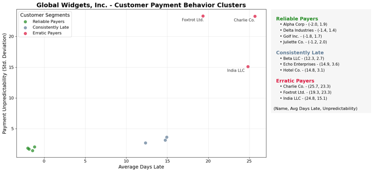
The Story for the Client:
This chart transforms your client’s collections strategy. We can now move them from a generic process to a targeted one based on data.
“We’ve analyzed your customer payment data and found three distinct groups:
- Reliable Payers (Cluster 0): These customers almost always pay on time. They are your best payers and should be treated as valued partners.
- Consistently Late (Cluster 1): This group pays, on average, 10-20 days late, but they do so predictably. The issue here is likely systemic or process-related, not a credit risk.
- Erratic Payers (Cluster 2): These customers are a major problem. Their payment timing is unpredictable, creating significant uncertainty for your cash flow forecasting.”
The Sales Opportunity:
This data-driven segmentation creates tailored openings for specific treasury solutions.
- For the “Consistently Late” group: The issue is likely process, not credit risk. Propose an Integrated Receivables Platform. This solution automates e-invoicing, sends scheduled payment reminders, and provides a digital portal where customers can easily pay via ACH or card.
- For the “Erratic Payers” group: This is where you bring in more robust solutions. Recommend a Lockbox Service. By directing these customers’ payments to a bank-controlled P.O. box, you accelerate the collection and processing of paper checks, reducing float and giving your client faster access to funds from their least reliable payers.
Conclusion: Why This Matters
By applying a simple machine learning model in Excel, we turned a flat list of invoices into a strategic advisory tool. We didn’t just perform an analysis; we built a data-driven business case that justifies investment in modern receivables solutions, accelerates the sales cycle, and solidifies our position as a trusted advisor.
Next time, in our final part, we’ll use the historical data we’ve gathered to forecast future cash gaps and proactively propose working capital financing.